
A usability case study for Quizlet Learn

Note: I’m not affiliated with Quizlet. Quizlet is a popular learning platform, and I set to explore possible opportunities for improvement.
01 Overview
Quizlet is one of the most popular online learning services in the United States. The platform provides tools and activities for students to learn and study. Of particular interest is Quizlet’s “Learn” activity, based on the principle of active learning rather than passive learning. Active learning has been shown to increase long term learning performance and retention. Quizlet Learn refines the active learning process by using a user’s previous performance to set the difficulty and repetition of future questions. I set out to explore possible feature enhancements to Quizlet Learn that might increase the overall effectiveness and engagement in this activity.
02 Research
Persona Development
I started by creating a provisional persona to summarize my assumptions about the user. I used it to guide my research, understand my users’ goals and needs, and relate my findings to Quizlet’s overall mission.

Joy, Student, 14, San Francisco
Job Stories
In addition to the persona, I also created job stories to document users’ potential motivations and desired outcomes when using Quizlet Learn.
Guerilla Usability Testing
Using my provisional persona and job stories as a guide, I conducted guerrilla usability tests with nine people. All participants were students, and some students were familiar with Quizlet. I asked a few screener questions before I had them imagine the following scenario and perform the task.
Imagine your teacher sends you this study set, how would you learn the words in the study set?
03 Synthesis and Analysis
Affinity Mapping
Based on the user testing sessions, I identified users’ pain points and categorized them into themes on a 2x2 matrix. I ranked the categories by how important they are to the user (x-axis) and how important they are the business (y-axis). Then, I ranked the major themes again based on difficulty of implementation (x-axis) and most impact (y-axis).

Participant observations

The sorting process surfaced two main pain points:
When users mistyped a word in their answer, no users selected the “I mistyped” option. Instead, they would select the “Continue” button.
Users reported being frustrated when their answer was marked incorrect because of a mistyped word. They felt their answer was correct. This would also affect their Learn progress. If you incorrectly answer a question, that word will reappear in the study set activity until you have mastered the word.
Other observations:
Users loved the “Learn" study activity.
Users like seeing their progress as they learned.
Users liked seeing what they specifically they got wrong.
Prioritizing Objectives
Based on the research findings, I prioritized the following objective as the main opportunity for a design improvement.
Reduce frustration and keep learning progress accurate when a user mistypes a word by making the “I mistyped” option more apparent.
Task flow
After identifying the main objective, I created a task flow. The task flow helped me focus on what happens before and after the user mistypes a word. This helped me to focus on what would be the most important design improvements.
04 Design Decisions
UI Sketching
I sketched screen options while keeping in mind the target user, the company’s student learning goals, and my objective to reduce frustration when learning despite a mistype.

Prototyping and Validation
Below is the prototype I used for testing and validation.

Since all participants in the guerilla usability study did not see the “I mistyped” option, I made it more visible by making it a button. I also changed the “Continue” button to match primary buttons in the Quizlet style guide.
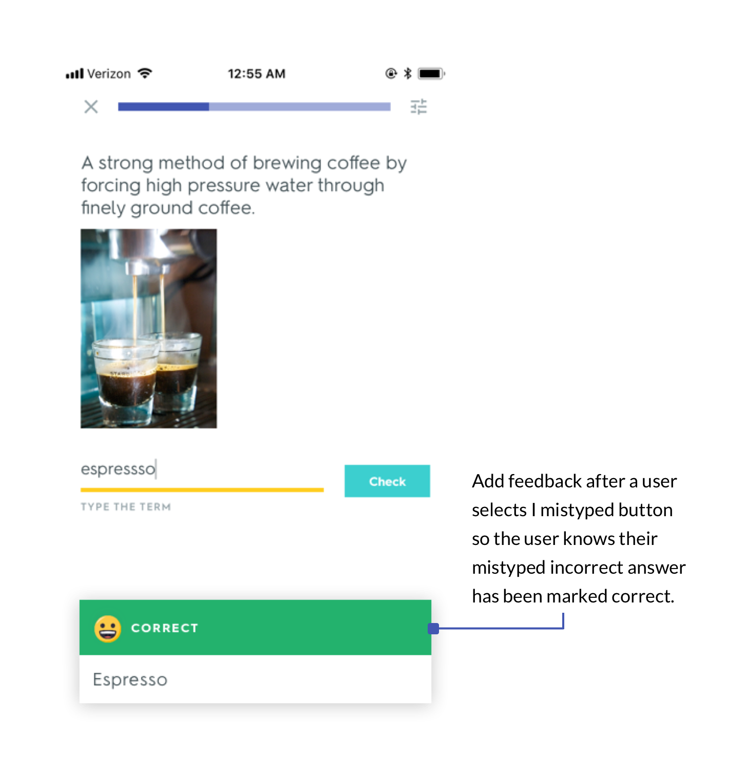
Previously, if you were to click the “I mistyped” option, the app would proceed to the next screen without any user feedback. In my prototype, I added an additional dialog that lets the user know that the mistype answer was marked as correct. The goal was to keep consistent with the existing Quizlet Learn answer feedback, and also to provide the user with a positive reward for their learning progress.
05 Design
Results
I tested the new design with six participants.
6/6 Users noticed I mistyped button
5/6 Users selected the I mistyped button when the answer was mistyped
Improving the user journey
Overall, the participants really enjoyed learning with the Quizlet Learn activity. Quizlet Learn aims to make studying efficient, fun, and effective. With those goals in mind, my design changes makes it easier for a user to correct a mistype word. This enables Quizlet to collect the user’s answers more accurately, while also removing potential frustration from getting a mistyped answer marked wrong. Collecting this data accurately is also important because Quizlet uses machine learning to decide which study questions need to be repeated based on whether the user answered the question correctly or incorrectly.
With a few changes in design, Quizlet’s Learn activity can collect more accurate data from users, enabling better immediate and long-term feedback to users about their progress. In turn, this should provide a better overall user experience and keep users wanting to use Quizlet.