

01 Overview
Client
Ongo Science is a health and wellness platform that enables health experts to create and monetize digital behavioral intervention programs in exercise, sleep, and mindfulness. Users can then subscribe to these programs through their mobile app.
I worked directly with the founders to ideate and design a web analytics dashboard that provides actionable insights for experts to improve their programs.
Role
Product Design Lead
I was responsible for managing the design sprints for our team of six. In addition, I created design system components, conducted research, explored various ideas through sketches, iterated designs through testing, and prototyped interactions.

Goals
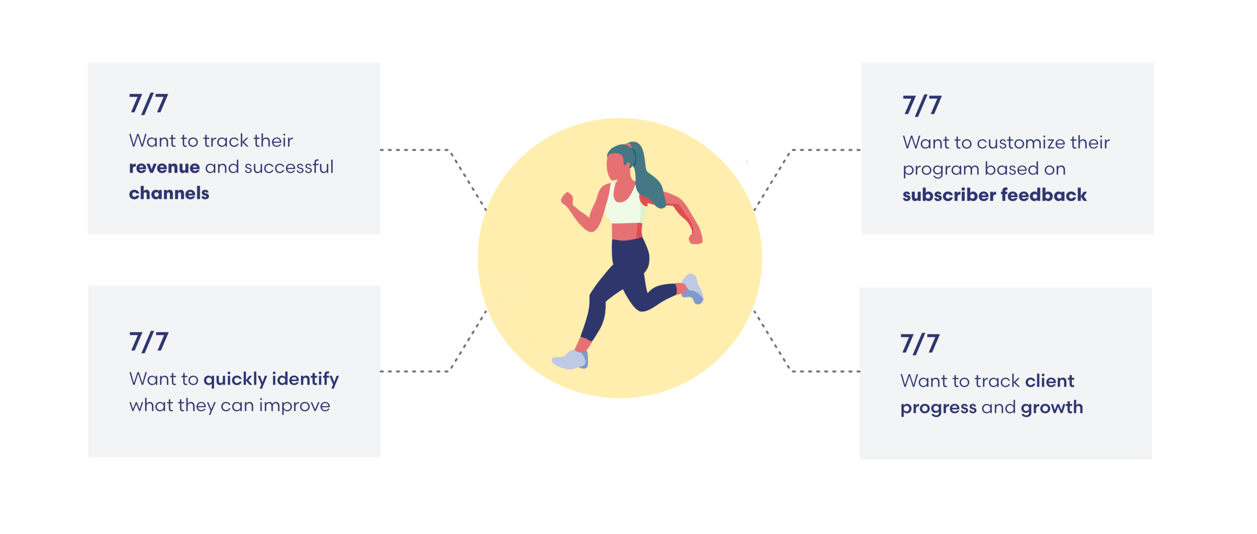
The main goal of the expert dashboard was to provide health experts a way to monitor their programs, revenue, and subscriber satisfaction. The data on the dashboard needed to provide actionable insights and metrics so health experts could improve the efficacy of their programs.
Results


02 User Research
Health Expert Interviews
After conducting 7 health expert interviews our team affinity mapped user needs and pain points and created personas. The interviews were conducted with personal trainers, yoga instructors, meditation coaches, life coaches, and health coaches.
Information Architecture
Our team conducted competitive and existing dashboard research including 13 different dashboards. We prioritized features and created the information architecture based on our interviews and dashboard research.

03 DESIGN Process
I facilitated a Google Venture “decide” day meeting, and our team dot voted on the individual sketches.

Then, our team created wireframes that were used to conduct usability tests. We continued to iterate and test our designs until we arrived at the final dashboard design.
04 Design
Our team designed two main views for the dashboard.
Health Expert Main View
- Program View
Health Expert Main View
The main view allows an expert to get high-level subscriber, revenue, and program information. Experts can monitor and compare program success through these metrics to evaluate program quality.

Program View
We designed a program dashboard view to better display relevant data and metrics specific to the expert's program success. By monitoring information such as program completion rate and subscriber satisfaction experts can modify their programs for success.

Final Design
As part of the final handoff, I created design components for Ongo's component library.
Results
After multiple design iterations our validation testing resulted in:
Purpose of Dashboard
5/5 understood the purpose of the dashboard
Revenue
5/5 identified monthly revenue & acquisition channel
Completion Rate
4/5 identified program completion
Program/Session Views
5/5 identified the most viewed program
Subscriber Satisfaction
5/5 identified subscriber satisfaction
Humanity Metric
4/5 identified tangible impact on subscribers