
01 Overview
Client
Ongo Science is a health and wellness platform that enables users to join communities where they can participate in tailored digital programs for behavioral interventions in exercise, sleep, and mindfulness.
I worked directly with the founders to ideate and design a mobile iOS onboarding flow aimed at increasing new user retention while also adding a new option for participants to onboard a community.
Role
Product Design Lead
I was responsible for managing the design sprints for our team of four. In addition, I created design system components, conducted research, explored varying ideas through sketches, iterated designs through testing, and prototyped interactions.

Goals
The main goals in redesigning the onboarding flow were to increase users’ understanding of Ongo’s unique value proposition, enable key app permissions, and collect user information to provide personalized user insights.
Results
- 6/7 participants enabled notifications
- 6/7 participants understood data driven insights UVP in testing
- 7/7 participants concluded onboarding flow was straightforward and easy

02 User Research
Identifying Problems
The project began with exploratory research and auditing. Initial comprehension tests and user interviews revealed Ongo’s mobile iOS app had several key issues that were negatively impacting user’s understanding of application and retention.

Observations
New users did not understand Ongo’s unique value proposition (UVP). The messaging was unclear and the flow left users feeling confused. In addition, users were not provided with context about personalization when asked for personal information or enabling app permissions. After onboarding, users landed on a homepage with an unpopulated dashboard. This resulted in missed opportunities for retention.
Recommendations
Our team researched competitive flows and onboarding best practices to gain insights that could inform the user flow and design. As a result, the main design recommendations were to:
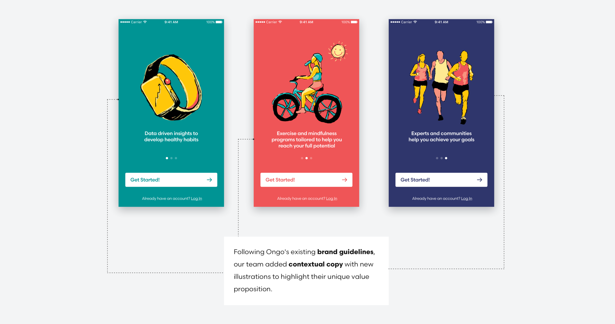
Clearly communicate Ongo’s unique value proposition through illustration and copy
Increase the retention opportunity by providing context before asking for permissions
Streamline sign-up process to give users an understanding of where they are

03 DESIGN Process
We first focused on the core user flow. I facilitated a design studio to ideate potential designs for the onboarding user flow based on our research.
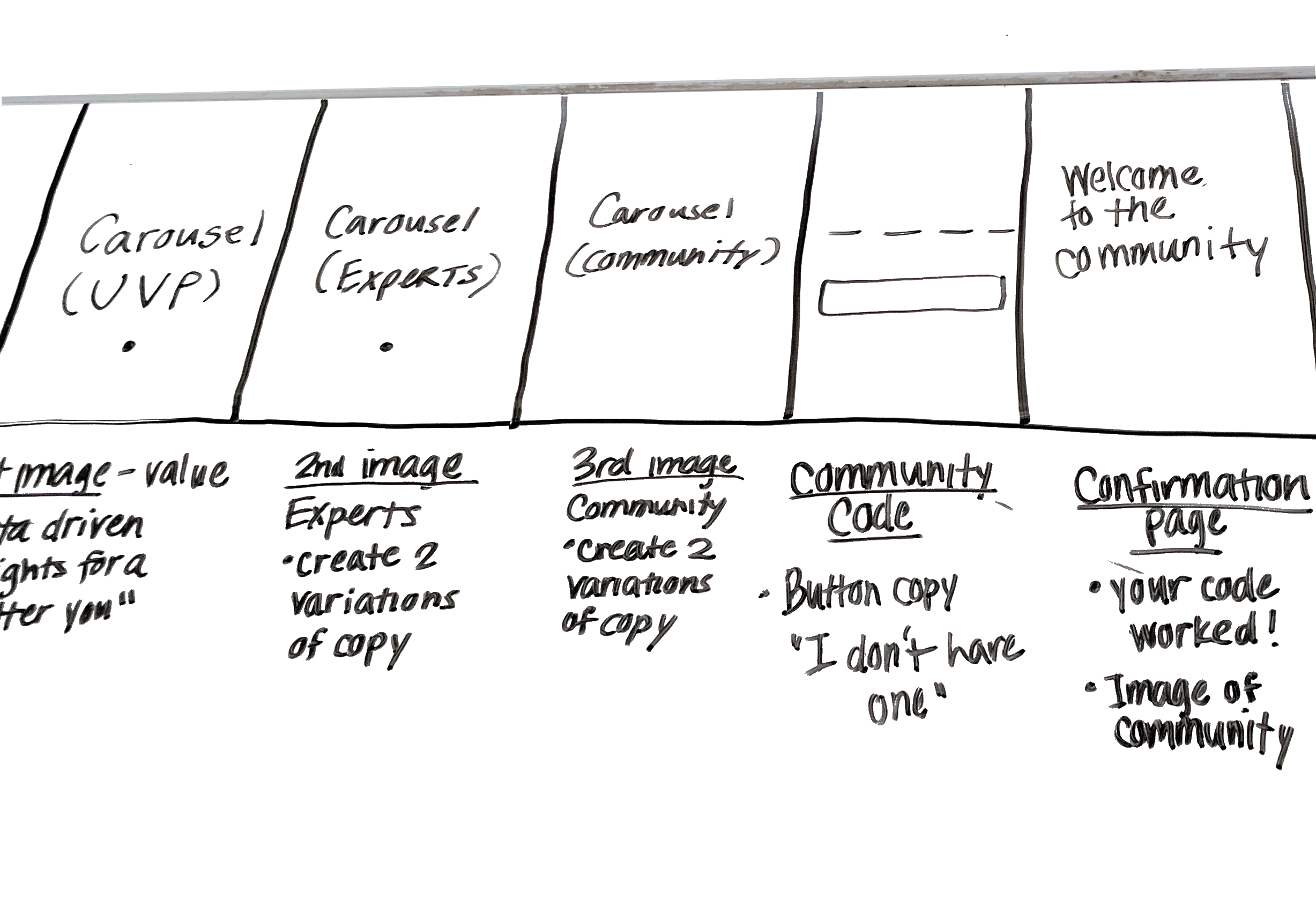
Our team then diverged to come up with onboarding storyboards based on our user flow. In order to efficiently decide what storyboard we would prototype, I facilitated a Google Venture “decide” day meeting, and our team dot voted on the ideas and features that were most impactful to the user experience.

Once we decided on the core user flow, our team created wireframes that were used to conduct usability tests. We continued to iterate and test our designs until we arrived at the final onboarding flow.
Design methods


04 Design
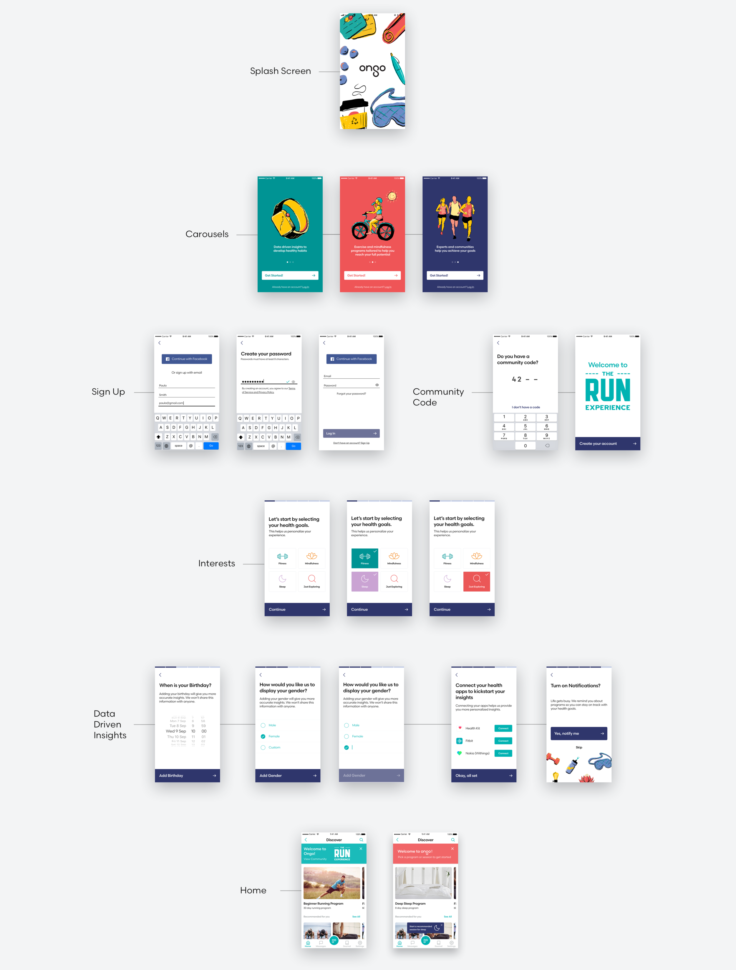
Illustrations and Copy
Part of what makes Ongo unique is a combination of their program experts, health communities, and personalized data driven insights. When comprehension testing the original app, we found many participants needed clarity on what industry the app was in and how the app could help them.
Health Goals
We also added a screen that allows users to set their health goals. The goal of this screen is to provide context of how the app could improve the user's life, and provide data insights that Ongo can use to tailor the app to fit the user's interest.

Permissions
One of our main goals was to get users to turn on notifications in order to increase adoption and overall retention.

Progress Bar
Based on our initial research, we wanted to improve the user's understanding of where they were in the sign-up process. We added a segmented progress bar to clearly indicate the user's progress and to act as a positive reinforcement for completing a screen.

Final Design
As part of the final handoff, I updated Ongo's existing component library to include the components from our design.
Results
After multiple design iterations our testing resulted in:
- 6/7 participants enabled notifications
- 6/7 participants understood data driven insights UVP in testing
- 7/7 participants concluded onboarding flow was straightforward and easy
05 Reflection
Onboarding is an important part of the user journey when it comes to adoption and retention. The task to balance Ongo’s needs to collect user information for data driven insights and provide value with each permission request proved to be challenging. It was critical for our team to conduct competitive analysis, exploratory research, and user interviews in order to create a core user flow that could be tested early in the design process.
In addition, maintaining consistent design components was important for the overall scalability of implementation for both designers and engineers. The app we redesigned has an estimated launch of Q3 2018.